Apple Adds a New Toggle to Make Liquid Glass Less Glassy
Apple is refining the iOS experience once again. With the iOS 26.1 beta, Apple adds a new toggle to make Liquid Glass less glassy, giving users more control over how transparent or frosted their interface looks. This update is small but impactful, offering better visibility and personalization for those who found Liquid Glass a bit too transparent since its debut at WWDC 2025.
What Is Apple’s Liquid Glass Design?
Liquid Glass is Apple’s sleek, layered visual effect that blends depth, light, and blur to give iOS a modern, polished appearance. It was first introduced with iOS 26 as part of Apple’s ongoing effort to merge minimalism with dimensional realism. While visually striking, some users felt that the glassy elements made text and icons harder to read in certain lighting conditions.
The new iOS 26.1 beta aims to fix that by allowing users to fine-tune the transparency — a subtle change that makes a noticeable difference in daily use.
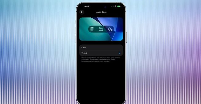
Where to Find the New Liquid Glass Toggle
The new option lives in Settings > Display & Brightness > Liquid Glass, where users can now choose between “Clear” and “Tinted” modes.
-
Clear Mode: Keeps the classic glossy, transparent look introduced in iOS 26.
-
Tinted Mode: Adds a slight frost, making the background more opaque and easier on the eyes.
Developers who’ve installed the iOS 26.1 beta can try it out immediately. According to reports, the feature is also available in iPadOS 26.1 and macOS 26.1, making this customization option consistent across Apple’s ecosystem.
Visual Comparison: Clear vs. Tinted
The differences between “Clear” and “Tinted” may seem subtle at first glance, but they can significantly impact usability. In side-by-side comparisons, the “Tinted” version reduces visual distractions, especially in bright environments. It also helps text and icons stand out better without sacrificing Apple’s signature design fluidity.
Many early testers say they prefer the “Tinted” look, calling it more balanced and comfortable for longer use.
Why Apple’s Move Matters
When Apple adds a new toggle to make Liquid Glass less glassy, it signals that the company is listening closely to feedback. Apple’s design philosophy has always revolved around clarity and user control, and this update aligns perfectly with that mission. By offering an option to tone down transparency, Apple strikes a balance between style and substance — something longtime fans and accessibility advocates can both appreciate.
This small feature reflects a larger pattern in Apple’s updates: giving users more ways to personalize their devices without compromising the design integrity that defines iOS.
Coming Soon to All Users
Currently, the toggle is part of the iOS 26.1 developer beta, but it’s expected to roll out to the public in the coming weeks. Once available, anyone running iOS 26 will be able to tweak their Liquid Glass settings instantly through the Display & Brightness menu.
Whether you prefer the pristine clarity of “Clear” or the subtle sophistication of “Tinted,” this feature is a welcome addition that improves usability across Apple devices.
The decision to let users tint Liquid Glass may seem like a small change, but it underscores Apple’s attention to design detail and user comfort. As Apple adds a new toggle to make Liquid Glass less glassy, it continues refining the fine line between aesthetics and accessibility — ensuring iOS feels as good to use as it looks.
With more visual flexibility and cross-platform consistency, this tweak shows how Apple’s design evolution is guided not just by innovation, but by thoughtful user experience.


Comment